9  Wider Atlantic temperature distribution index

Dolphin have a circumtropical distribution, migrating to temperate waters in summer and tropical waters in winter, in a circular pattern around the Atlantic Ocean. Studies using satellite tagging have shown that, similar to other highly migratory species, they prefer waters within a narrow temperature range, of 27-30 degrees Celsius Schlenker et al. 2021. To determine whether shifting temperature distributions across the Atlantic could be impacting the abundance in U.S. waters, we analyzed Atlantic Ocean temperature patterns at the large spatial and temporal scale.

9.1 Accessing temperature data

For this analysis we need a historical temperature record that is available at large spatial (entire Atlantic) and temporal (monthly-yearly) scales. We use NOAA’s Extended Reconstructed Sea Surface Temperature (ERSST) data, provided by the NOAA National Centers for Environmental Information and available through ERDDAP. This temperature record goes back to the mid-1800s, is available at monthly time steps and a 2°x2° grid size resolution, and is suitable for looking at large-scale patterns over decades. We download the data from 1980 - present and subset for the Atlantic Ocean from 100°W - 0°W longitude and 0°N - 70°N latitude.

# clear workspace
rm(list = ls())

# install libraries
if(!require("maps")) install.packages("maps")
# if(!require("ncdf4")) install.packages("ncdf4")
# if(!require("lubridate")) install.packages("lubridate")
# if(!require("rerddap")) install.packages("rerddap")

 library(maps)
# library(ncdf4)
# library(lubridate)
# library(rerddap)

# get ERDDAP info 
# id <- info('nceiErsstv5')   #https://coastwatch.pfeg.noaa.gov/erddap/griddap/nceiErsstv5.html

# download data using griddap - initially takes a long time
# uncomment lines below to update analysis
# sst_grab <- griddap(id, fields = 'sst', 
#                    time = c('1990-01-01', '2025-01-01'), 
#                    longitude = c(260, 358), latitude = c(0, 70))

# open nc file and extract variables
# nc <- nc_open(sst_grab$summary$filename, write=FALSE, readunlim=TRUE, verbose=FALSE)
# v1 <- nc$var[[1]]
# sst <- ncvar_get(nc, v1)
# lon <- v1$dim[[1]]$vals - 360
# lat <- v1$dim[[2]]$vals
# nc_close(nc)

# convert time variable to month and year
#tim <- as.POSIXct(v1$dim[[4]]$vals, origin = "1970-01-01")
#mon <- as.numeric(substr(tim, 6, 7))
#yr <- substr(tim, 1, 4)
#dim(sst)

#save(sst, lon, lat, tim, mon, yr, file = "data/ERSST.RData")

load("data/ERSST.RData")

# check conversions
tim[1:5]
[1] "1990-01-01 UTC" "1990-02-01 UTC" "1990-03-01 UTC" "1990-04-01 UTC"
[5] "1990-05-01 UTC"
table(mon)
mon
 1  2  3  4  5  6  7  8  9 10 11 12 
36 35 35 35 35 35 35 35 35 35 35 35 
table(yr)
yr
1989 1990 1991 1992 1993 1994 1995 1996 1997 1998 1999 2000 2001 2002 2003 2004 
   1   12   12   12   12   12   12   12   12   12   12   12   12   12   12   12 
2005 2006 2007 2008 2009 2010 2011 2012 2013 2014 2015 2016 2017 2018 2019 2020 
  12   12   11   12   12   12   12   12   12   12   12   12   12   12   12   12 
2021 2022 2023 2024 2025 
  12   12   12   12    1 
# plot SST on map for first time step
par(mfrow = c(1, 2))
image(lon, lat, sst[, , 100], las = 1, xlab = "longitude (deg W)", ylab = "latitude (deg N)", 
      main = "Snapshot of ERSST data"); box()

# fill Pacific Ocean with NAs so values are not included
sst[which(lon <= (-92)), which(lat <= 17.5), ] <- NA
sst[which(lon <= (-85)), which(lat <= 15), ] <- NA
sst[which(lon <= (-83)), which(lat <= 10), ] <- NA
sst[which(lon <= (-77)), which(lat <= 8.5), ] <- NA
sst[which(lon <= (-78) & lon >= (-80)), which(lat <= 9), ] <- NA
image(lon, lat, sst[, , 100], las = 1, xlab = "longitude (deg W)", ylab = "latitude (deg N)", 
      main = "Snapshot of ERSST data\n(Pacific excluded)"); box()

9.2 Analyzing high and low availability years

In order to identify potential temperature patterns that are influential in driving dolphin abundance in the U.S. South Atlantic waters, we identify the years of highest and lowest landings and look at the temperature distributions monthly in those years.

# upload recreational landings
rec <- read.csv("data/recLandings.csv")
names(rec)[1] <- "Year"

# summarize by basin and total
rec$ATL <- rowSums(rec[3:6], na.rm = T)
rec$ALL <- rec$GULF + rec$ATL

# consider 1990 and forward
rec <- rec[which(rec$Year >= 1990), ]

# sort years from lowest to higher landings
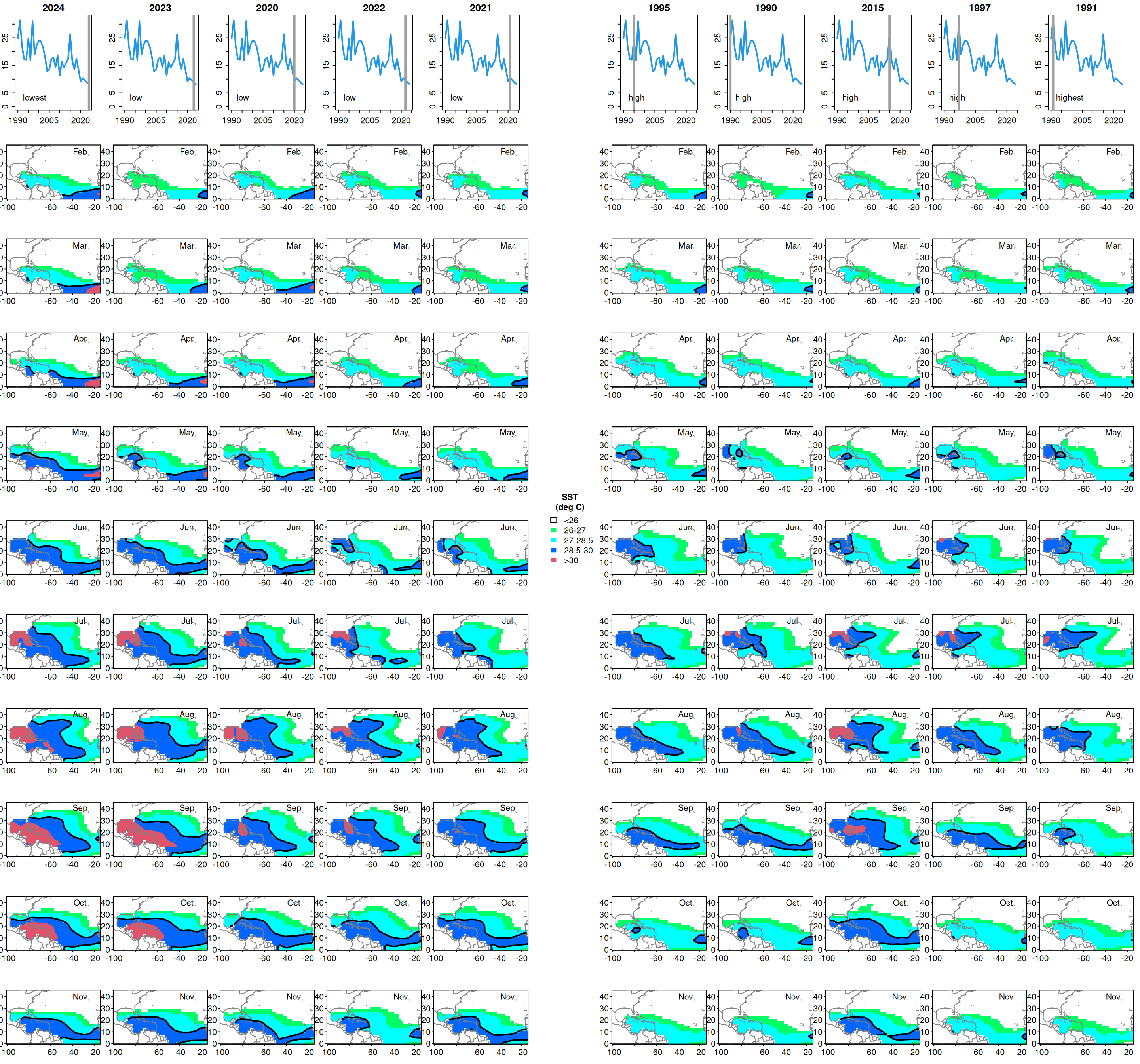
sortyr <- rec$Year[order(rec$ALL)]

# cols <- rainbow(100, start = 0.1, end = 0.65)[100:1]
cols <- c(0, rainbow(3, start = 0.4, end = 0.6), 2)

# set up plot
nf <- layout(matrix(c(2:56, rep(1, 11), 57:111), 11, 11, byrow = FALSE), 
             c(rep(3, 5), 2, rep(3, 5)), c(4, rep(3, 11)))
#layout.show(nf)

#legend
par(mar = c(0, 0, 0, 0))
plot(1, type = "n", axes = FALSE, xlab = "", ylab = "")
legend("center", fill = cols, c("<26", "26-27", "27-28.5", "28.5-30", ">30"),
       border = c(1, 0, 0, 0, 0),
       pt.cex = 2, bty = "n", 
       title = "SST\n(deg C)", title.font = 2)

# sort years from lowest to highest landings
yrs <- c(sortyr[1:5], sortyr[(length(sortyr)-4): length(sortyr)])
#yrs
status <- c(rep("low", 5), rep("high", 5))
status[1] <- "lowest"
status[10] <- "highest"

# for lowest and highest years, visualize temperature patterns across the Atlantic
for (j in 1: length(yrs))  {
  k <- which(yr == yrs[j])
#  print(data.frame(tim[k], yr[k], mon[k]))
  par(mex = 0.5, mar = c(2, 2, 2, 2)+1)
  plot(rec$Year, rec$ALL/10^6, type = "l", col = 4, ylim = c(0, 32), lwd = 2, ylab = "rec landings", 
       main = yrs[j])
  text(1990, 3, status[j], pos = 4)
  abline(v = yrs[j], col = 8, lwd = 3)
  
  # plot months February through November
  for (i in k[2:11])  { 
    par(mex = 0.3, mar = c(2, 3, 2, 0))
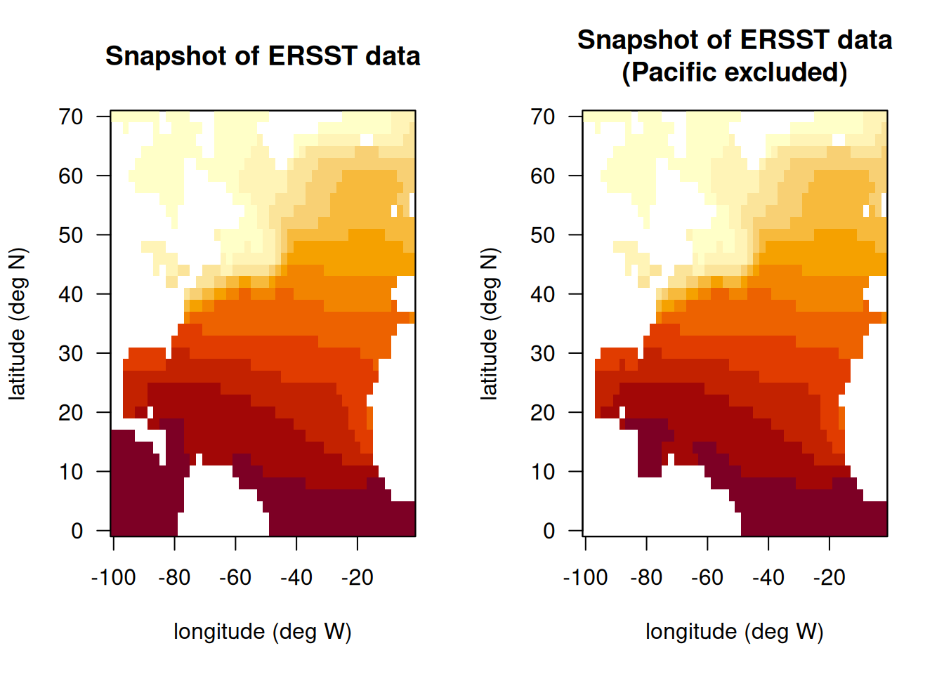
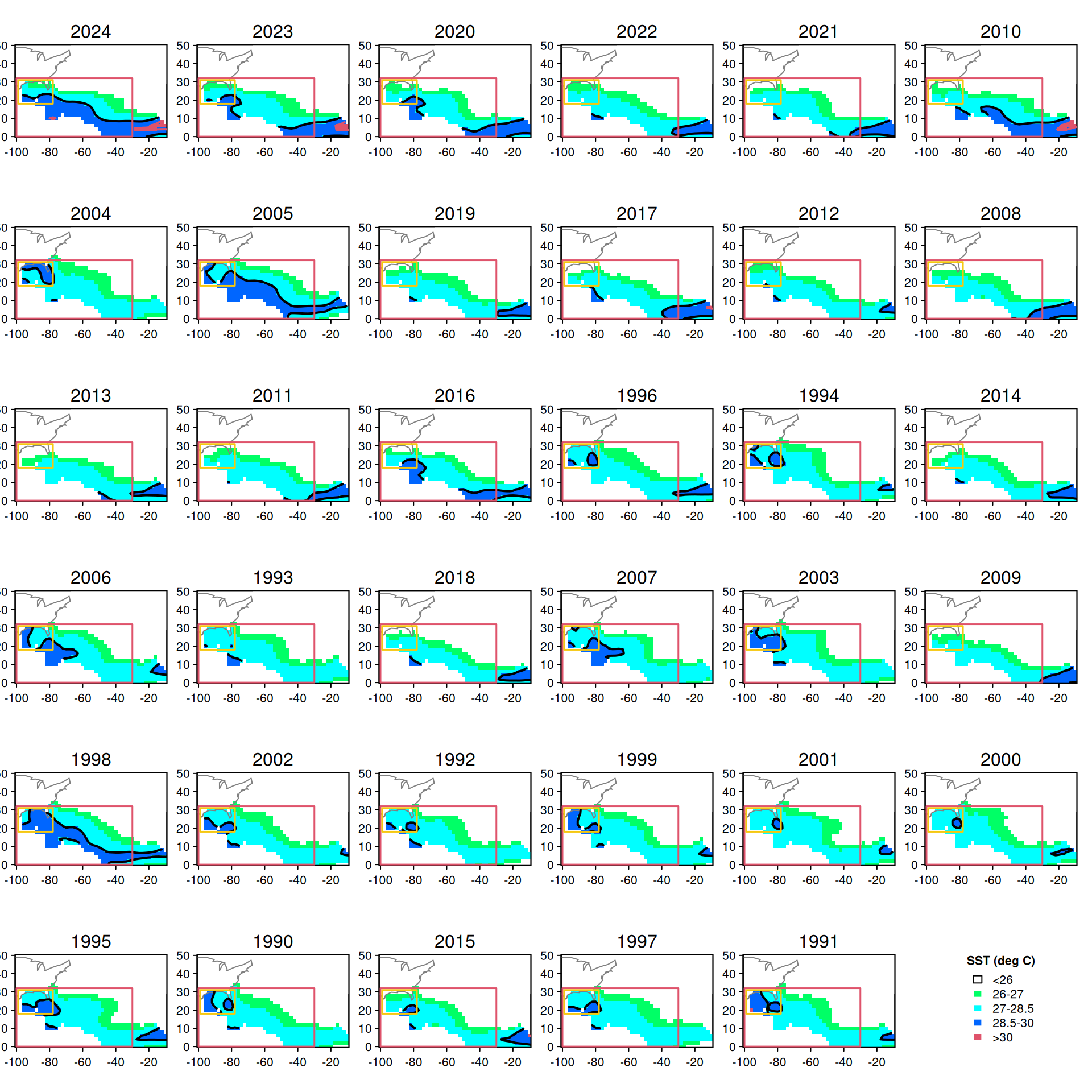
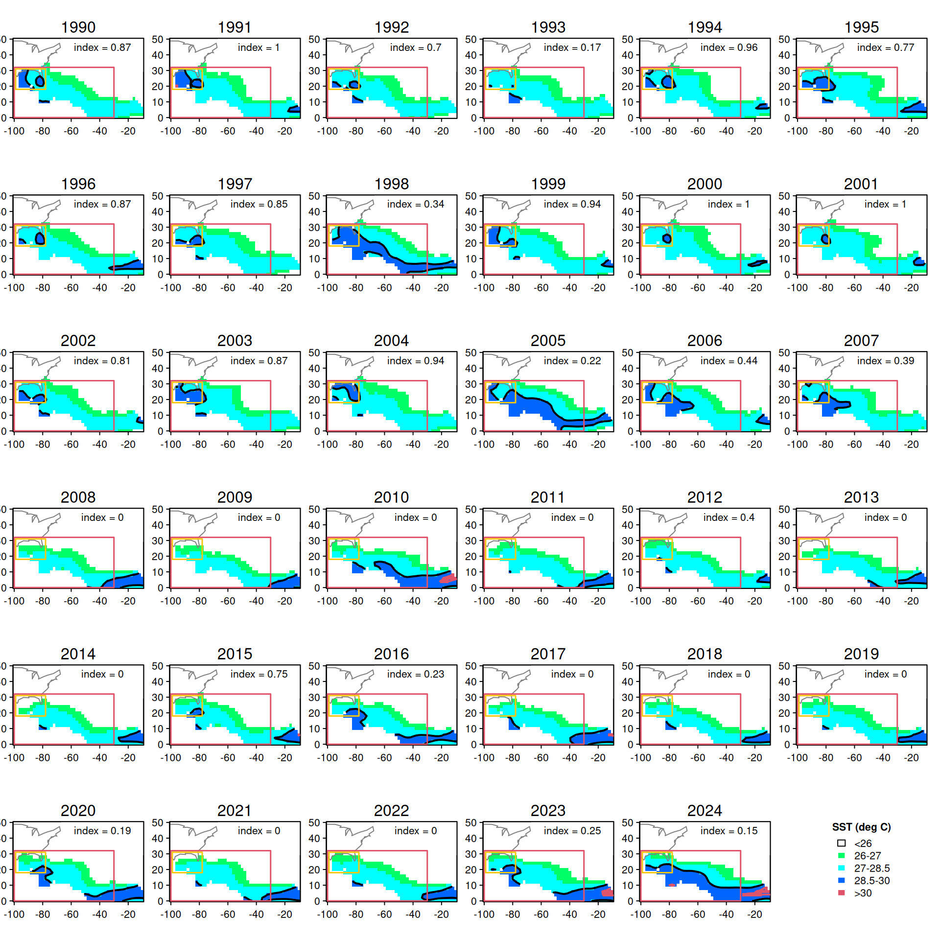
    map("world", xlim = c(-100, -15), ylim = c(0, 45), col = 0)
    axis(1); axis(2, las = 2); box()
    image(lon, lat, sst[, , i], add = T, col = cols, breaks = c(-2, 26, 27, 28.5, 30, 32))
    text(-33, 40, paste(month.abb[mon[i]]), cex = 1)
    map("world", add = T, col = gray(0.5)); box()
    contour(lon, lat, sst[, , i], levels = c(30), add = T, col = c(2), lwd = 2, drawlabels = FALSE)
    contour(lon, lat, sst[, , i], levels = c(28.5), add = T, col = 1, lwd = 2, drawlabels = FALSE)
  }
}

Looking at the set of plots on the left side (low abundance years) versus the right side (high abundance years), there seems to be a particularly notable pattern with respect to temperatures in the range of 28.5° - 30° Celsius. In the low abundance years, temperatures in this range are distributed in a band across the Atlantic near the equator. In the high abundance years, waters near the equator are much cooler and the 28.5° - 30° temperatures appear to be concentrated in a very small area near the Florida Keys. This pattern seems most prominent in the months of May and June.

9.3 May temperature distributions

We will take a closer look at May temperature distributions across the Atlantic for the full time series. Here we display all of the May temperatures from 1990 to present, ordered from lowest to highest years of recreational landings in the U.S. South Atlantic.

# look at May patterns --------------------

par(mfrow = c(6, 6), mex = 0.5, mar = c(2, 2, 2, 0))

for (j in 1: length(sortyr))  {
  k <- which(yr == sortyr[j])
  for (i in k[5])  { 
    map("world", xlim = c(-100, -10), ylim = c(0, 50), col = 0)
    axis(1); axis(2, las = 2); box()
    image(lon, lat, sst[, , i], add = T, col = cols, breaks = c(-2, 26, 27, 28.5, 30, 32))
    map("usa", add = T, col = gray(0.5)); box()
    mtext(side = 3, line = 0.5, sortyr[j])
    contour(lon, lat, sst[, , i], levels = c(30), add = T, col = c(2), lwd = 2, drawlabels = FALSE)
    contour(lon, lat, sst[, , i], levels = c(28.5), add = T, col = 1, lwd = 2, drawlabels = FALSE)
    rect(-100, 0, -30, 32, col = NA, border = 2, lwd = 1.5)
    rect(-99, 18, -78, 31, col = NA, border = 7, lwd = 1.5)
  }
}
par(mar = c(0, 0, 0, 0))
plot(1, type = "n", axes = FALSE, xlab = "", ylab = "")
legend("center", fill = cols, c("<26", "26-27", "27-28.5", "28.5-30", ">30"),
       border = c(1, 0, 0, 0, 0),
       pt.cex = 2, bty = "n", 
       title = "SST (deg C)", title.font = 2)

The pattern with 28.5° - 30° C waters seems to hold across all years, with low abundance years (top) tending to have these waters distributed across the Atlantic, and high abundance years (bottom) tending to have these waters restricted to a small area near the Gulf and U.S. South Atlantic.

9.4 Quantifying the temperature distribution in an index

We can attempt to quantify these patterns in an index by calculating a proportion of waters covered by the dark blue water mass. It seems most useful to consider the coverage of this water mass that occurs in U.S. South Atlantic waters (approximately the yellow box; 100°W-78°W and 18°N-32°N) versus the coverage of this water mass in the larger North Atlantic region (the larger red box; 100°W-30°W and 0°-32°N). We first calculate the number of cells in which these 28.5° - 30° C waters occur in each box, and then divide to obtain an overall proportion.

# calculate proportion of 28.5 - 30 degree C waters in US South Atlantic waters

# subset the temperature data to 100W - 30W and 0N - 32N
lons <- which(lon >= (-100) & lon <= (-30))
lats <- which(lat >= (0) & lat <= (32))
lon[lons]
 [1] -100  -98  -96  -94  -92  -90  -88  -86  -84  -82  -80  -78  -76  -74  -72
[16]  -70  -68  -66  -64  -62  -60  -58  -56  -54  -52  -50  -48  -46  -44  -42
[31]  -40  -38  -36  -34  -32  -30
lat[lats]
 [1]  0  2  4  6  8 10 12 14 16 18 20 22 24 26 28 30 32
# find indexing for 100W - 78W and 18N - 32N
lonind <- which(lon[lons] <= (-78) & lon[lons] >= (-100))
latind <- which(lat[lats] <=32 & lat[lats] >= 18)

# subset SST data for all May months
kar <- sst[lons, lats, which(mon == 5)]

# create empty data frame
ind <- data.frame(matrix(ncol = 2, nrow = dim(kar)[3], 
                         dimnames = list(NULL, c("Year", "perar"))))
ind$Year <- yr[which(mon == 5)]

# for each year, identify SST cells between 28.5 and 30 degrees
# calculate the proportion of those waters within the small box out of the large box
for (i in 1:dim(kar)[3])  {
  k1 <- kar[, , i]
  k2 <- (k1 >28.5 & k1 < 30.0)
  ind$perar[i] <- length(which(k2[lonind, latind] == TRUE))/ length(which(k2 == TRUE))
}

# replace NA values with zero
ind$perar[which(is.na(ind$perar))] <- 0
ind
   Year     perar
1  1990 0.8666667
2  1991 1.0000000
3  1992 0.7000000
4  1993 0.1666667
5  1994 0.9629630
6  1995 0.7692308
7  1996 0.8666667
8  1997 0.8500000
9  1998 0.3402778
10 1999 0.9393939
11 2000 1.0000000
12 2001 1.0000000
13 2002 0.8076923
14 2003 0.8723404
15 2004 0.9411765
16 2005 0.2214286
17 2006 0.4444444
18 2007 0.3888889
19 2008 0.0000000
20 2009 0.0000000
21 2010 0.0000000
22 2011 0.0000000
23 2012 0.4000000
24 2013 0.0000000
25 2014 0.0000000
26 2015 0.7500000
27 2016 0.2343750
28 2017 0.0000000
29 2018 0.0000000
30 2019 0.0000000
31 2020 0.1929825
32 2021 0.0000000
33 2022 0.0000000
34 2023 0.2500000
35 2024 0.1538462
yrs <- sortyr[order(sortyr)]

par(mfrow = c(6, 6), mex = 0.5, mar = c(2, 2, 2, 0))
for (j in 1:length(yrs))  {
  k <- which(yr == yrs[j])
  for (i in k[5])  { 
    map("world", xlim = c(-100, -10), ylim = c(0, 50), col = 0)
    axis(1); axis(2, las = 2); box()
    image(lon, lat, sst[, , i], add = T, col = cols, breaks = c(-2, 26, 27, 28.5, 30, 32))
    map("usa", add = T, col = gray(0.5)); box()
    mtext(side = 3, line = 0.5, yrs[j])
    text(-38, 45, paste("index =", round(ind$perar[which(ind$Year == yrs[j])], 2)))
    contour(lon, lat, sst[, , i], levels = c(30), add = T, col = c(2), lwd = 2, drawlabels = FALSE)
    contour(lon, lat, sst[, , i], levels = c(28.5), add = T, col = 1, lwd = 2, drawlabels = FALSE)
    rect(-100, 0, -30, 32, col = NA, border = 2, lwd = 1.5)
    rect(-99, 18, -78, 31, col = NA, border = 7, lwd = 1.5)
  }
}
par(mar = c(0, 0, 0, 0))
plot(1, type = "n", axes = FALSE, xlab = "", ylab = "")
legend("center", fill = cols, c("<26", "26-27", "27-28.5", "28.5-30", ">30"),
       border = c(1, 0, 0, 0, 0),
       pt.cex = 2, bty = "n", 
       title = "SST (deg C)", title.font = 2)

To ensure correct calculation of the index we re-display the May temperature patterns in chronological order and note the index value on each plot.

9.5 Comparison of “blue blob” index with landings

Now we plot the “blue blob” index against the recreational landings.

# merge new index with landings data
d <- merge(rec, ind, by = "Year")
#head(d)

# plot the "blue blob" index against recreational landings
par(mar = c(5, 5, 1, 1))
plot(d$perar, d$ATL/10^6, col = 0, 
     xlab = "proportion of preferred dolphin temperatures near\nU.S. jurisdictions (out of entire Caribbean basin) in May", 
     ylab = "total U.S. Atlantic coast recreational landings\n(millions of pounds)")
text(d$perar, d$ATL/10^6, d$Year)
out <- lm(d$ATL/10^6 ~ d$perar)
abline(out, lty = 2, col = 2)
abline(v = mean(d$perar), col = 8)
abline(h = mean(d$ATL)/10^6, col = 8)
text(0.7, 28, "preferred temperatures clustered\nnear U.S. waters == higher landings", col = "darkgreen", font = 3)
text(0.25, 10.5, "preferred temperatures extend across\nCaribbean and/or absent from\nU.S waters == lower landings", col = "darkred", font = 3)

We can see that a statistical relationship does exist, whereby above average “blue blob” index values are associated with above average recreational landings in U.S. South Atlantic waters, and below average index values are associated with below average landings. Gray lines denote the mean values for the index and the landings; we see that this relationship holds true for almost all years in the time series.

The “blue blob” index explains about 45% of the variation in the landings in the U.S. South Atlantic.

summary(out)

Call:
lm(formula = d$ATL/10^6 ~ d$perar)

Residuals:
    Min      1Q  Median      3Q     Max 
-9.9082 -3.0254  0.0927  2.6638  9.6171 

Coefficients:
            Estimate Std. Error t value Pr(>|t|)    
(Intercept)   12.391      1.094  11.324 6.58e-13 ***
d$perar       10.079      1.880   5.361 6.35e-06 ***
---
Signif. codes:  0 '***' 0.001 '**' 0.01 '*' 0.05 '.' 0.1 ' ' 1

Residual standard error: 4.339 on 33 degrees of freedom
Multiple R-squared:  0.4655,    Adjusted R-squared:  0.4493 
F-statistic: 28.74 on 1 and 33 DF,  p-value: 6.352e-06
# output the index
write.csv(ind, file = "indices/blue_blob_index.csv", row.names = F)